UI/UX Case Study | Flower Bouquet Website
Blossom: Flower Bouquet Website Design
Blossom helps customers view and buy flowers. It provides an easy user experience for customers seeking flower arrangements for various occasions.
Project Overview
This project focuses on designing a website that aims to help customers view and purchase flower bouquets for themselves or their loved ones.
Researching, Ideating, DesigningJanuary - February 2025
Adobe Illustrator, Figma
RoleTimeframe
Tools
Project Problem
There are many online flower ordering websites that prioritize displaying products over user experience, making it difficult to customize arrangements. I identified an opportunity to redesign a flower e-commerce experience that focuses more on simplicity and personalization. Customers often purchase flowers to communicate feelings whether it be sympathy, gratitude, celebration, or love. I also noticed that existing interfaces can sometimes feel cluttered.
This project redesign builds upon a previous design I created, refining the interface to support a smoother shopping experience.
User Research
I analyzed existing online flower retail shops to understand how users shop for bouquets. I conducted a market analysis for ProFlowers, Bouqs, and 1-800-Flowers, focusing on navigation structure, checkout flows, and how the bouquets were presented.
Through the analysis, I recognized that these purchases are time-sensitive. Users are purchasing for meaningful occasions. Too much clutter or complex categorization can slow decision-making and add friction for the customer. Creating a clear and concise interface helps users quickly find the arrangements that they need.
Key insights from research:
Time-sensitive purchases require a clear, non-cluttered interface for fast navigation
Categorization helps users shop by occasions
Simplified checkout flows reduces friction
Too many features, promotions, or pop-ups can feel overwhelming
I defined two primary user archetypes: everyday buyers seeking quick, thoughtful purchases and professional planners who require easy purchases without spending too much time searching.
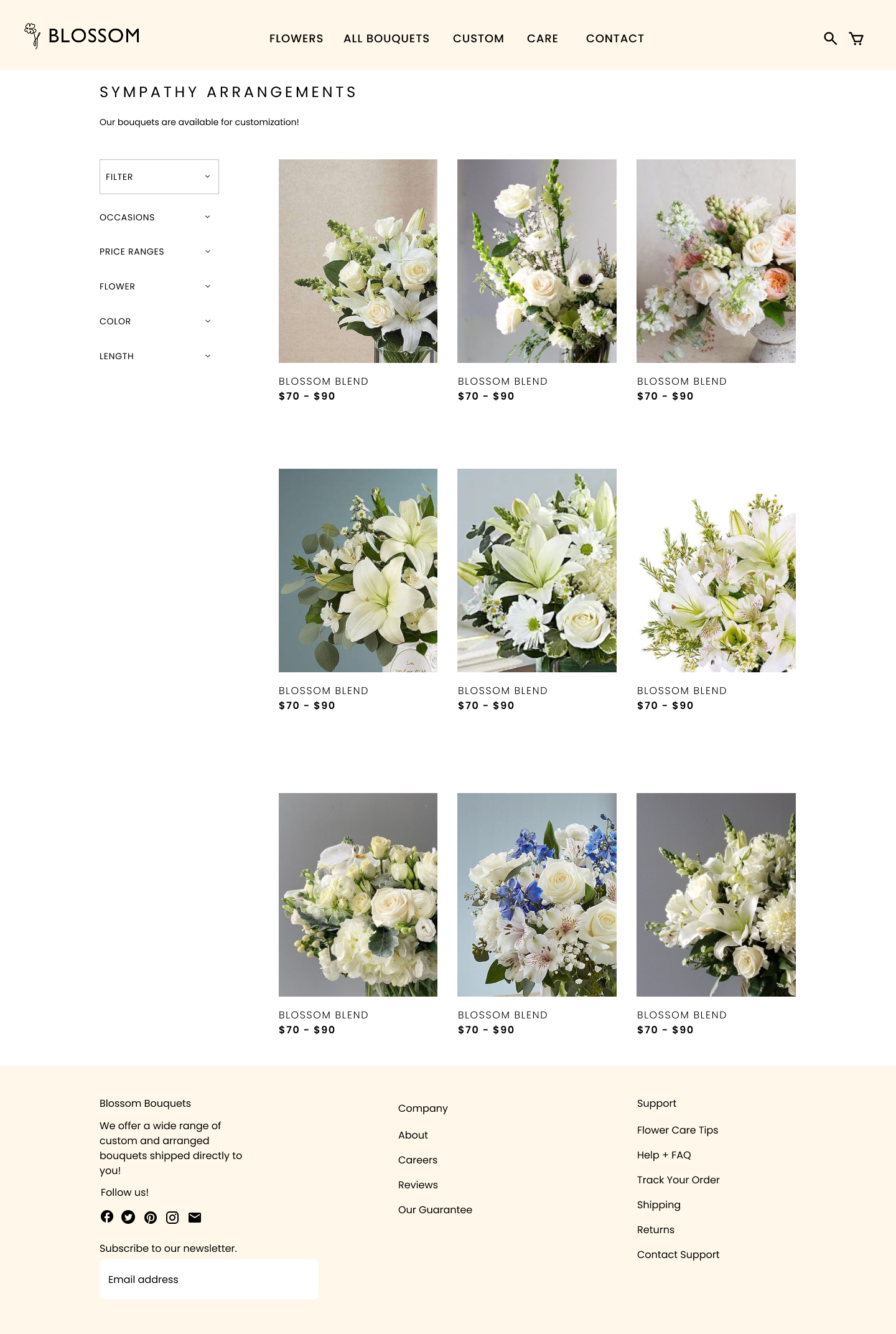
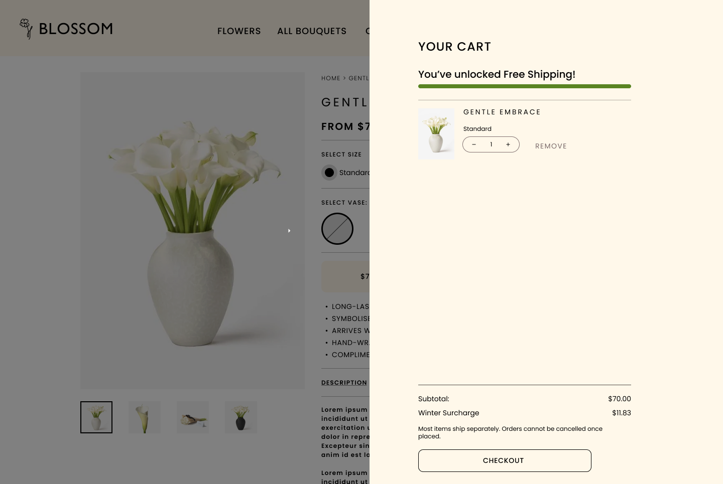
Project Solution
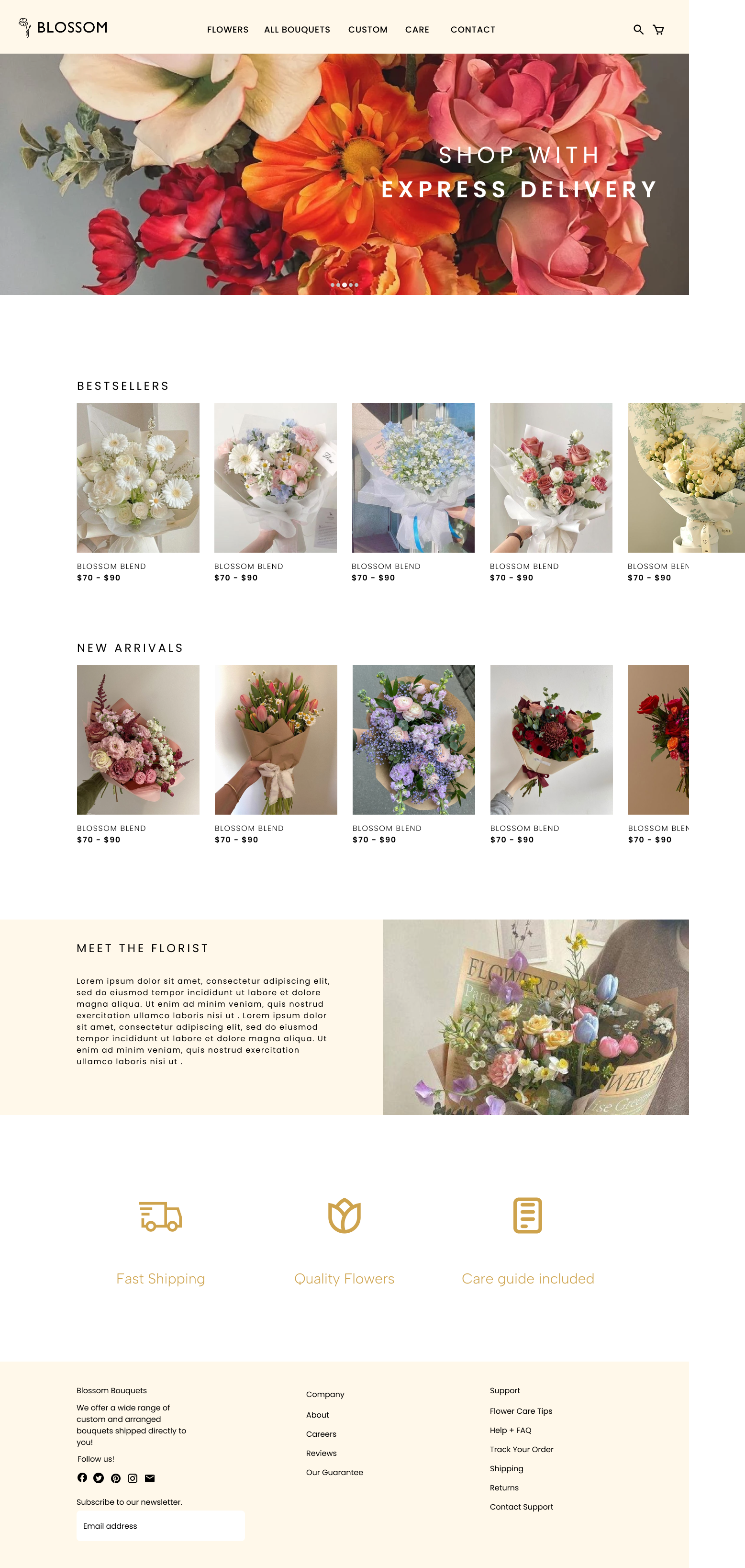
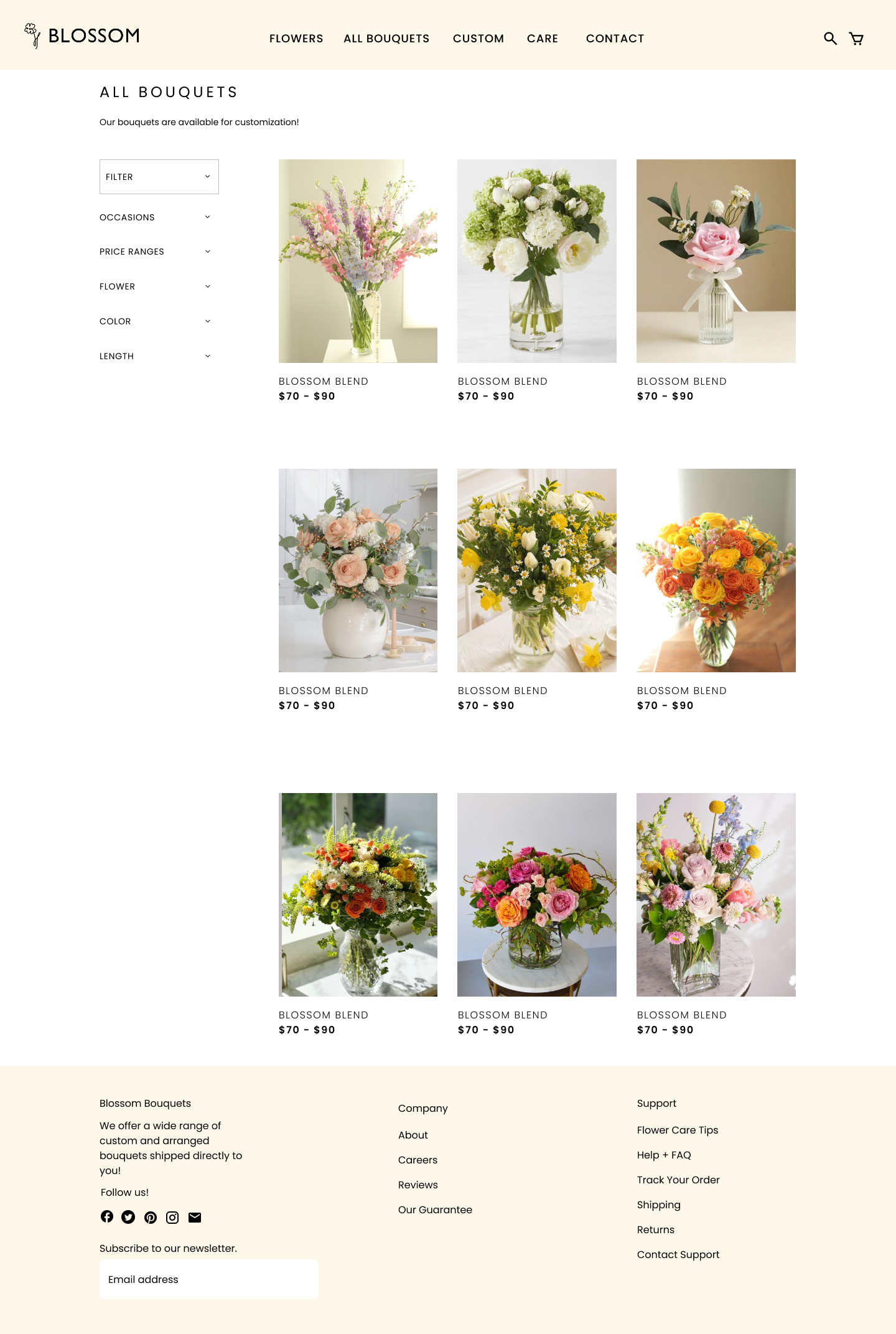
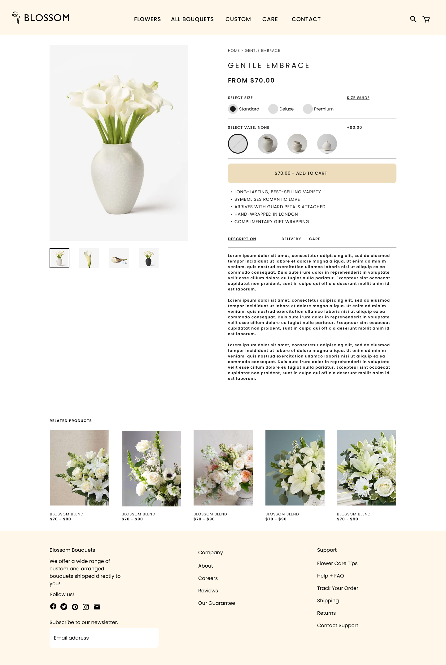
The solution focused on translating the research insights into a structured shopping experience that supports quick purchasing decisions. I sketched wireframes using a grid-based layout to establish the hierarchy. The website anatomy was organized to prioritize navigation, allowing users to find arrangements without unnecessary searching.
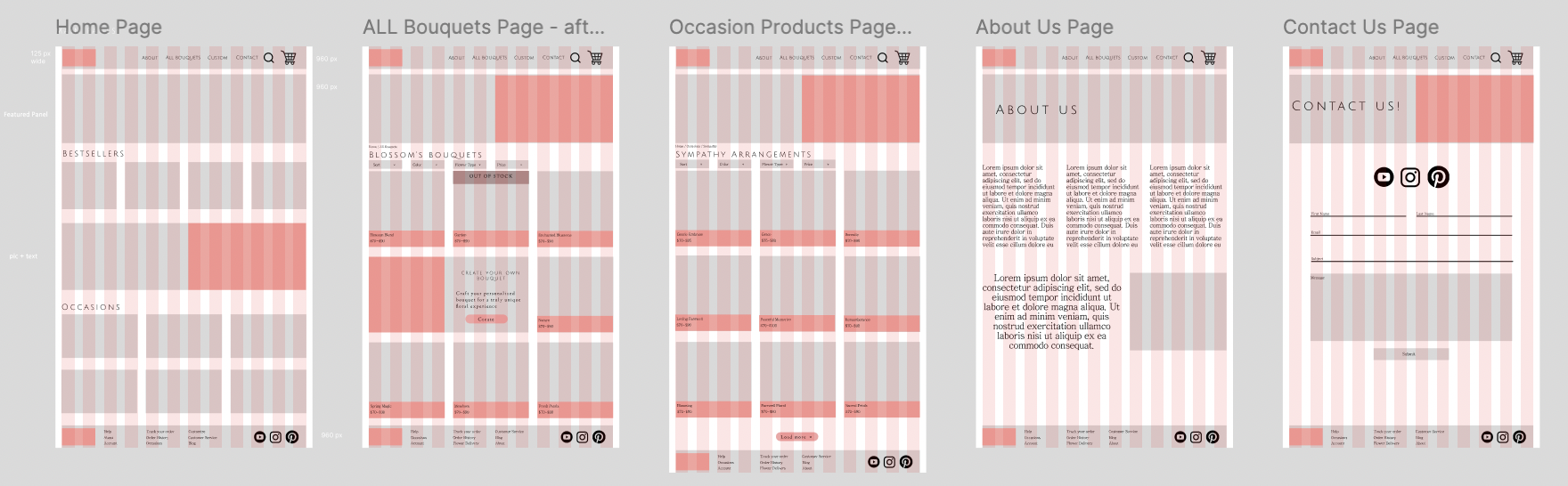
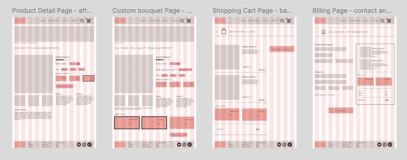
I developed a sitemap that mapped primary, secondary, and tertiary pages. In order to maintain consistency throughout the interface, I created a comprehensive visual system including style guides, asset rules, and brand standards. These guidelines defined logo usage, color palette, typography hierarchy, and imagery spacing.
The final design emphasizes the consistent product presentations, established color system, and clarity within the flow.
Design Process
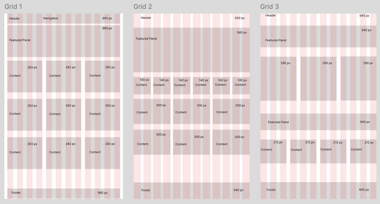
3 possible grid layouts for the website anatomy
Low Fidelity Wireframing
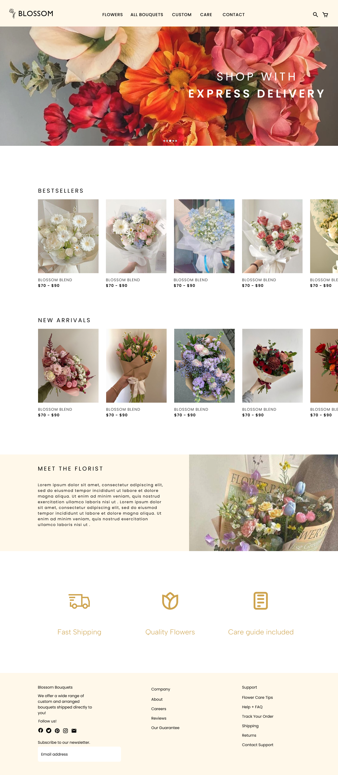
High Fidelity Wireframing
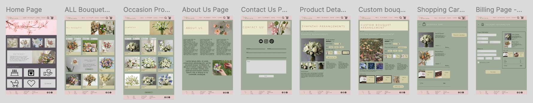
Re-Design of High Fidelity Wireframing
Outcome
This project focused on redesigning a previous flower website that lacked a structured grid system and had a cluttered, inconsistent layout. The original design made navigation confusing, and by revisiting the project, I was able to rebuild the interface with a more intentional design structure.
Throughout this redesign process, I learned how iteration directly impacts usability. By comparing the initial version to the final design, it allowed me to see the progression of my design decisions and understand how some small changes can transform the user experience. This project made me understand the importance of revisiting previous work, refining choices, and understanding that design is an evolving iterative process.